
I approached this stage initially with some apprehension because I wanted cohesion within the album itself. I thought maybe the opening pages could be similar so to introduce each summer in the same way. So, I stuck to a simple formula.
So I've posted two full layouts here for you to see and a few details about the design of each.
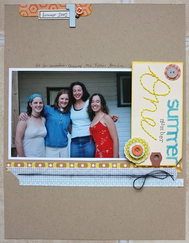
Here is my layout for summer #1:
Here is my layout for summer #10:
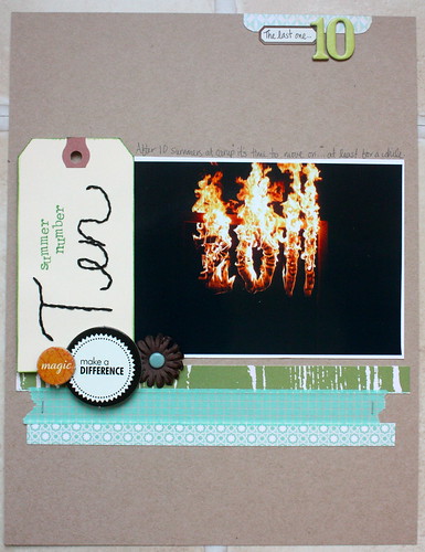
You can see that I anchored my photo and hand-stitched tag with a couple strips of pattern paper and some washi tape. They're in a group of three because I love the 'rule of three', stemming from the 'rule of odds', for artists and graphic designers.
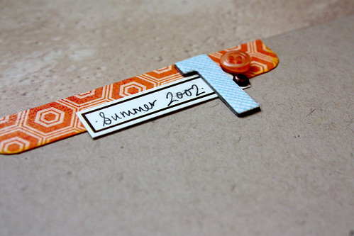
Here's an example with Summer #2:
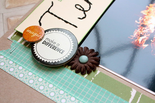
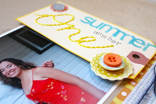
I also added a little group of embellishments on the tag and added a 'pre-title', so to speak, because I felt that the number stitched on the tag was too bland and needed a little more explanation.
At the top of each page I've collected a similar arrangement of objects-a number, a label and an embellishment stacked on a little strip of pattern paper. This serves to balance and anchor the layout.
Summer #1:
Summer #2:

You'll notice that many of the rules of design and elements of design are incorporated into my page layouts. I've tried to use odd numbers of embellishments as they are visually appealing to the eye when grouped together. Related to this 'rule of odds' is the idea that triangles are visually appealing as well. Think about your eyes and nose or your eyes and mouth as a triangle. I've attempted to organize my work into triangles as well. In summer #1 you'll notice that the buttons form a visual triangle. See if oyu can find more elements of the 'rule of odds' or the 'triangle' in my work!
My binder album is already starting to look very thick now that there are 10 layouts in it.
This week I've been working on the digital layouts for the coordinating pages for these opening layouts. The digital pages are more about 'story' than they are about the photos and the fanciness of the embellishments.
I'll have another update soon.
Krista
No comments:
Post a Comment